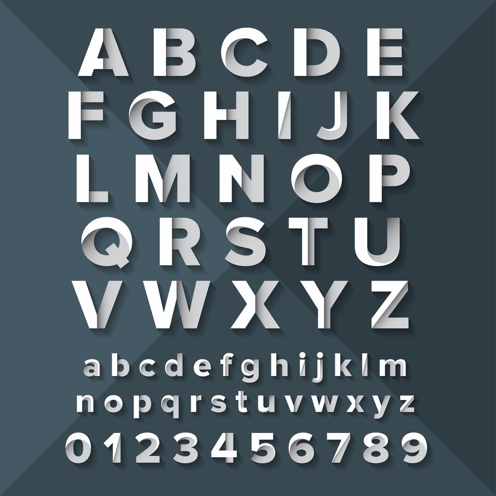
Font design is sometimes overlooked when planning and developing a website. After all, there’s the navigation, layout, color scheme, and logo to think of — all of which contribute to an extremely intensive design process. But what makes all of these come together? You’re right. It’s your website font.
Website fonts provide balance by combining all these different elements that you’ve used into one cohesive unit. Once your audience gets an overall look at your site, it’s the text that keeps them glued. Whether your site is a blog or an e-commerce store, your visitors will be reading about you, your brand, and your products. And your website font will either be standing out (in a bad way) or blending in.
Picking Out The Right Font
1. Make it match your brand.
Is your site supposed to be chic, rugged, funny, or serious? The font you choose should match your brand’s tone. Obviously, you shouldn’t use Comic Sans when your website is about medical supplies. Your choice of typography should contribute to your website’s overall storytelling.
Questions to ask:
- What is the nature of the brand?
- Do you want to stand out (in which case choose a unique font) or are you choosing for function?
- Is your website visually-driven or will it have large amounts of text?
2. Go with clear fonts and safe typefaces.
Unless your font is meant to catch attention to announce sales, promotions, or other marketing gimmicks, it’s better to select a straightforward design that won’t stick out so much.
A safe typeface is one that will let your reader understand what is being said at a glance. Your audience shouldn’t have to spend extra seconds trying to decipher what you’ve posted. And it’s better that you use a traditional typeface than an outlandish one if it means that you’re not distracting from your site’s overall communication goals.
3. Don’t aim for more than three types of fonts.
Too much of a good thing can be bad. Since the primary goal of fonts in websites is to maintain unity between the pages, a good rule of thumb is to pick out one font for larger texts (such as headings) and one font for the body. You can also opt for a third one to use for accents (navigational menus, call-to-action buttons, etc.).
4. Apply text themes.
You’ll need to decide on what sizes your headings, subheadings, and body of text will be and then apply the same theme throughout your website.
5. Apply contrast.
Contrast between fonts in headings/subheadings and body can break apart large walls of text and make your message appear more interesting and less monotonous. (Do take care not to overdo it since not all contrasting fonts will work together.)
Let’s put it this way. A grey suit worn with a black shirt, belt and shoes will look far more interesting than a grey suit worn with the same shade of shirt, belt, and shoes.
Typography makes up about 90% of website content.
Your website font has a direct influence on visitor experience. Make it count by choosing a design that will pull off your overall look without sacrificing your message. If you need help with making your concept translate to website design, EPIC can help. Drop us a note, and we’ll get right back to you as soon as we can.


